Quiet-Luxury Color Combos for Beach Days That Make Summer Outfits Look More Refined
Quiet-luxury beach dressing usually has less to do with buying more and more to do with choosing cleaner color pairings. The right mix of soft neutrals, rich darks, and sun-warmed tones can make simple resortwear feel far more polished before you add any extra styling.
This guide focuses on beach-day color combos that still feel wearable in real life: lunch by the water, a walk through the resort, late afternoon by the pool, and the kind of golden-hour dinner where you want to look sharp without feeling overdone.
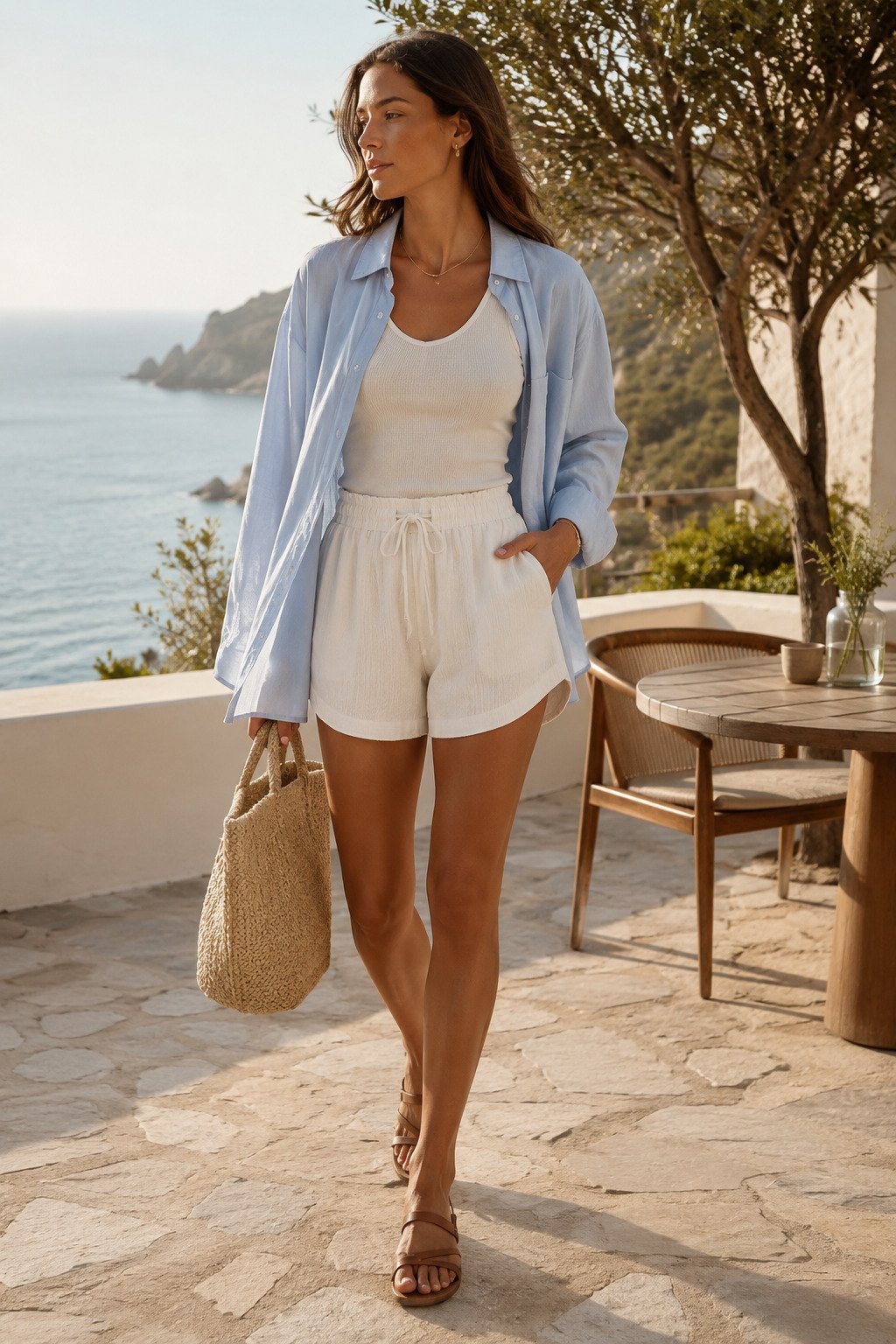
Salt blue and ivory feel crisp without looking too obvious
This is one of the easiest beach-day combinations to trust because it looks clean in bright light and still feels soft enough for a relaxed vacation setting. A pale blue linen shirt over ivory basics gives just enough contrast to look styled, but it never feels loud.
Use it for breakfast terraces, early check-ins, or slow walks before the heat peaks. The trick is to keep the accessories light too, so the color pairing stays airy instead of slipping into a more nautical, heavier mood.
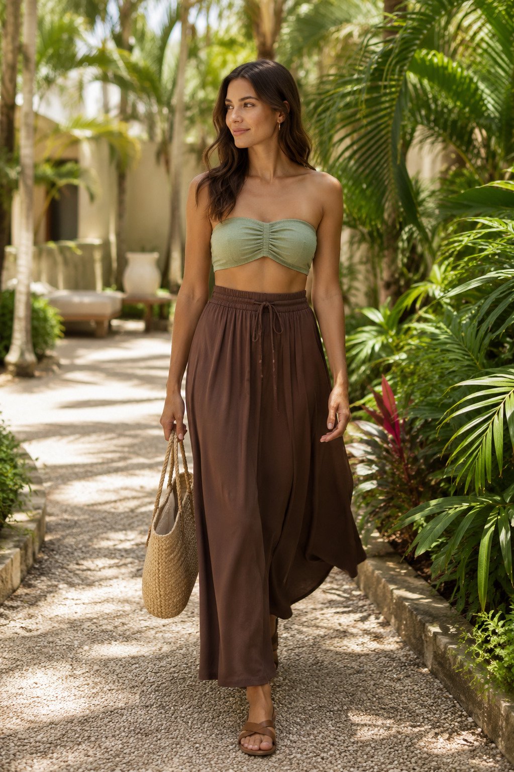
Espresso brown with shell white gives beachwear instant depth
Brown works especially well near the water because it adds richness without the severity that full black can sometimes bring in daytime sun. Paired with shell white, it reads expensive, balanced, and just a little more editorial than classic tan-and-white resortwear.
This combo is strongest when one piece feels fluid, like a maxi skirt or open shirt. That movement keeps the darker tone soft and makes the whole outfit feel more like vacation dressing than a sharply contrasted city look.
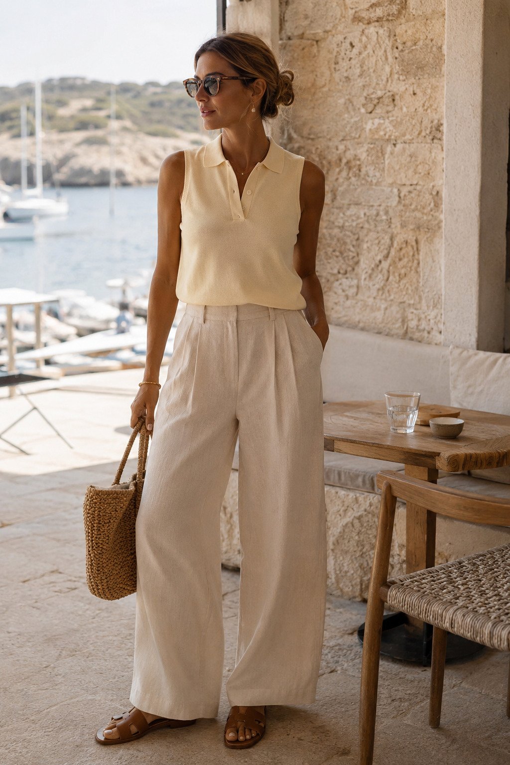
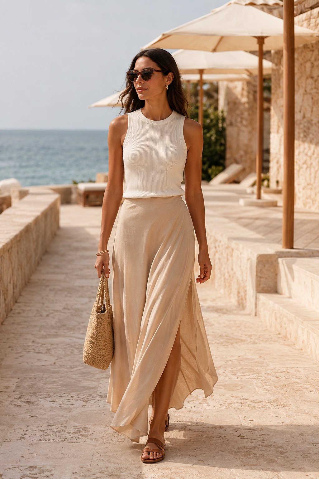
Butter yellow and warm stone bring a softer version of summer color
If you want to step outside neutrals without losing that quiet-luxury feel, butter yellow is one of the safest ways to do it. Against a warm stone or oat trouser, it feels sunlit and premium rather than playful or trend-chasing.
This pairing is ideal for lunch terraces, marina walks, and resort shopping because it photographs beautifully in natural light. It also keeps the outfit warm-toned, which helps the whole look stay cohesive even with simple sandals and a woven bag.
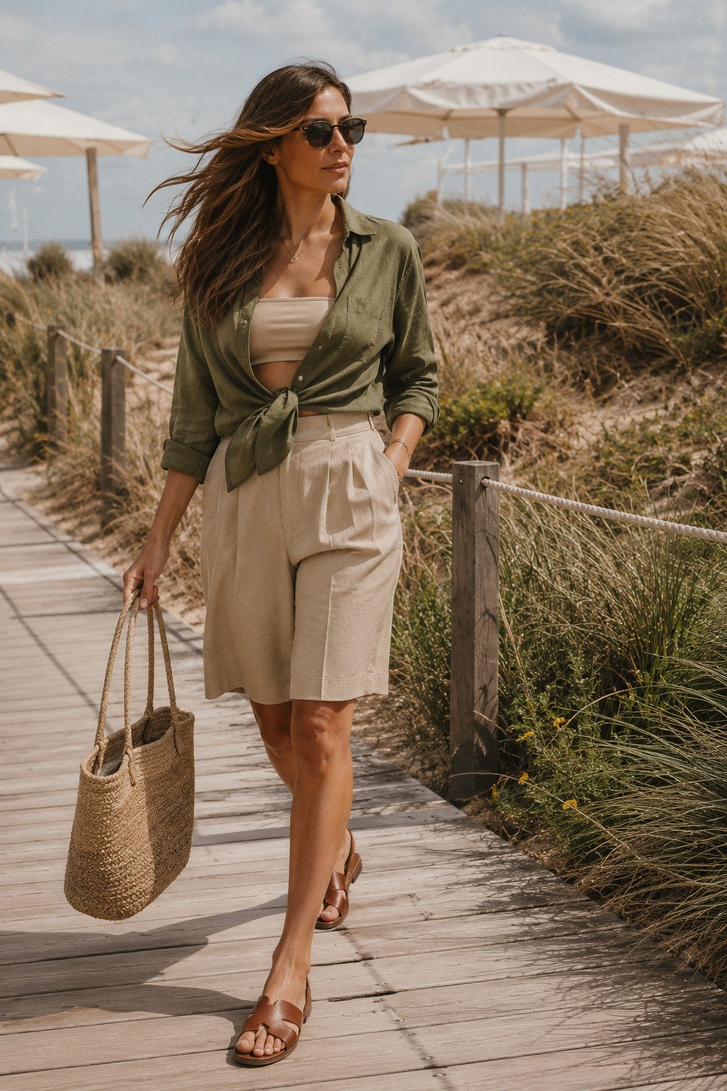
Olive and sand look grounded, natural, and very easy to repeat
Olive is one of the most underused beach colors, especially when you want something less expected than navy or black. With warm sand tones, it feels calm, grown-up, and practical for real beach movement without losing visual interest.
Because both shades sit close to nature, the combination works beautifully in dune settings, resort gardens, and beach-club paths. It also hides small styling imperfections well, which makes it a smart repeat outfit on longer vacations.
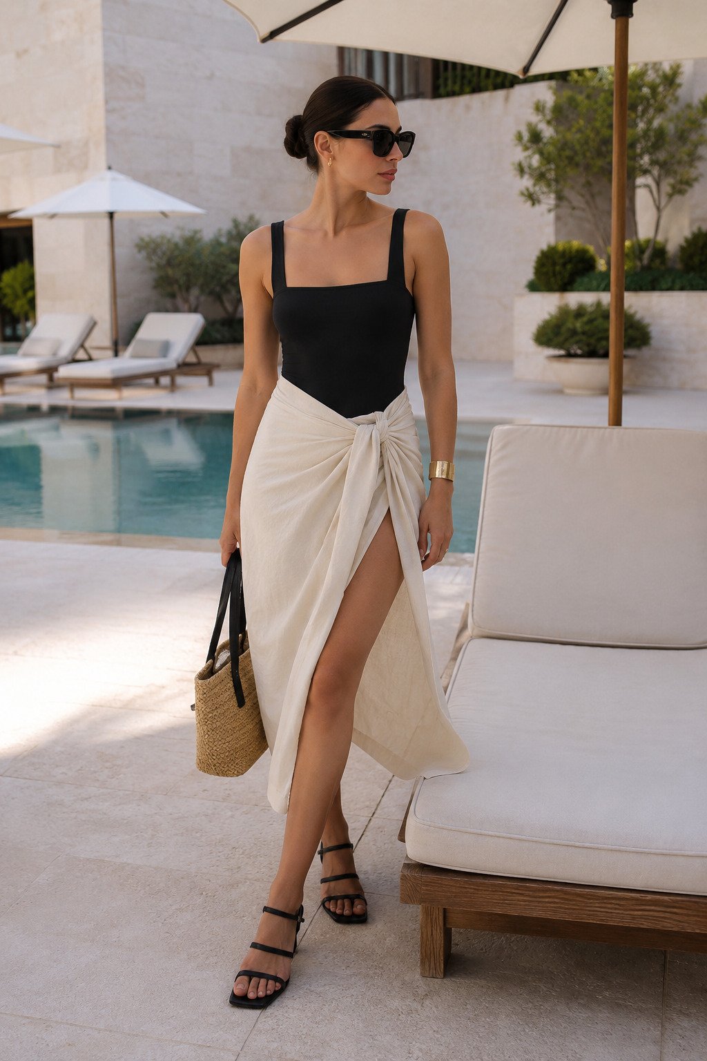
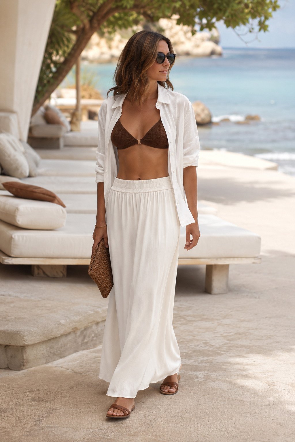
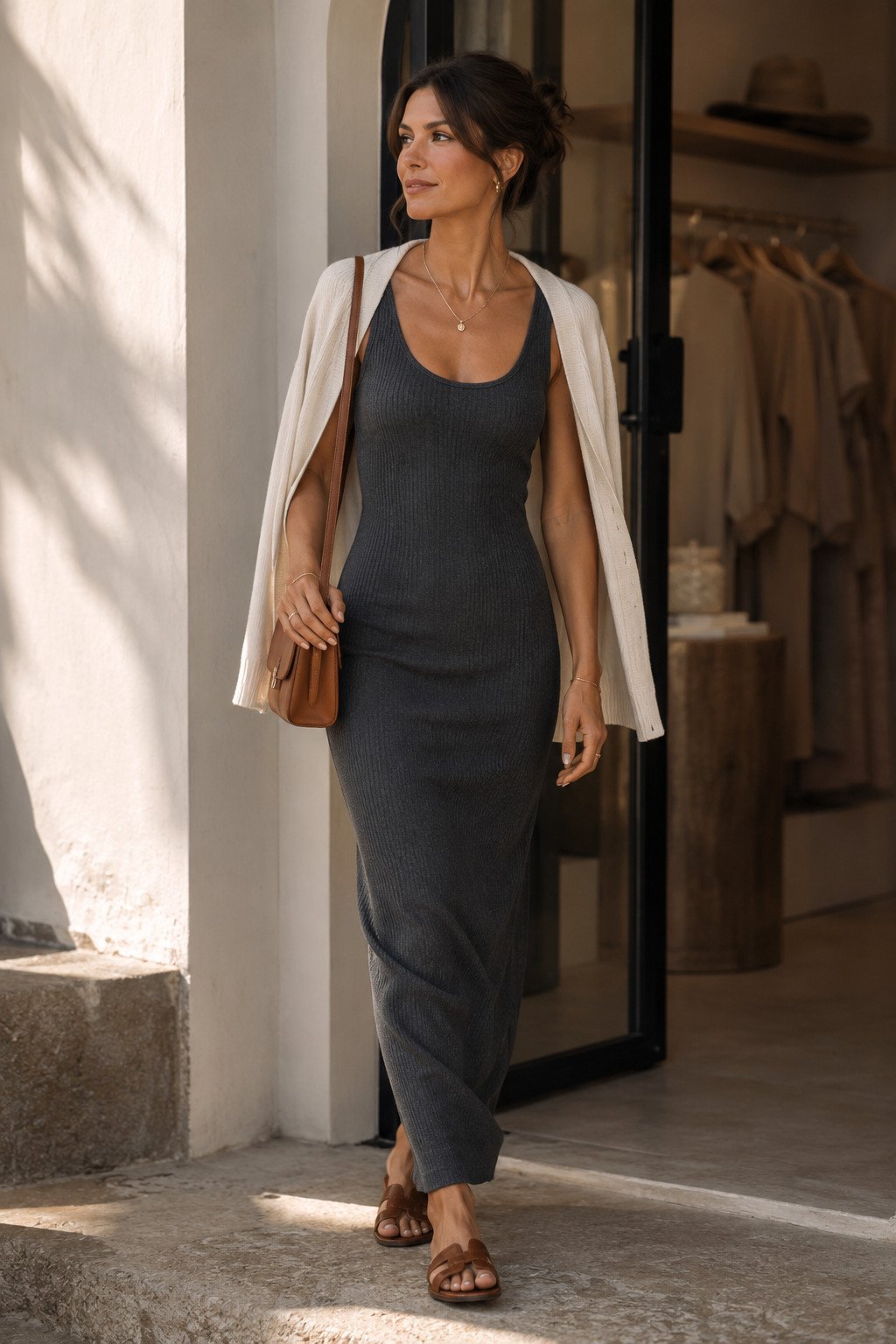
Black and cream sharpen simple swim-to-lounge styling fast
Some beach days still need one look that feels sleek enough for a polished pool terrace or a late lunch reservation. Black and cream deliver that shape immediately, especially when the black element is close to the body and the cream piece softens everything around it.
The result feels cleaner than bright prints and more intentional than matching neutral separates. It is also one of the easiest color stories to push slightly dressier later in the day with just a cuff, sunglasses, or a neater sandal.
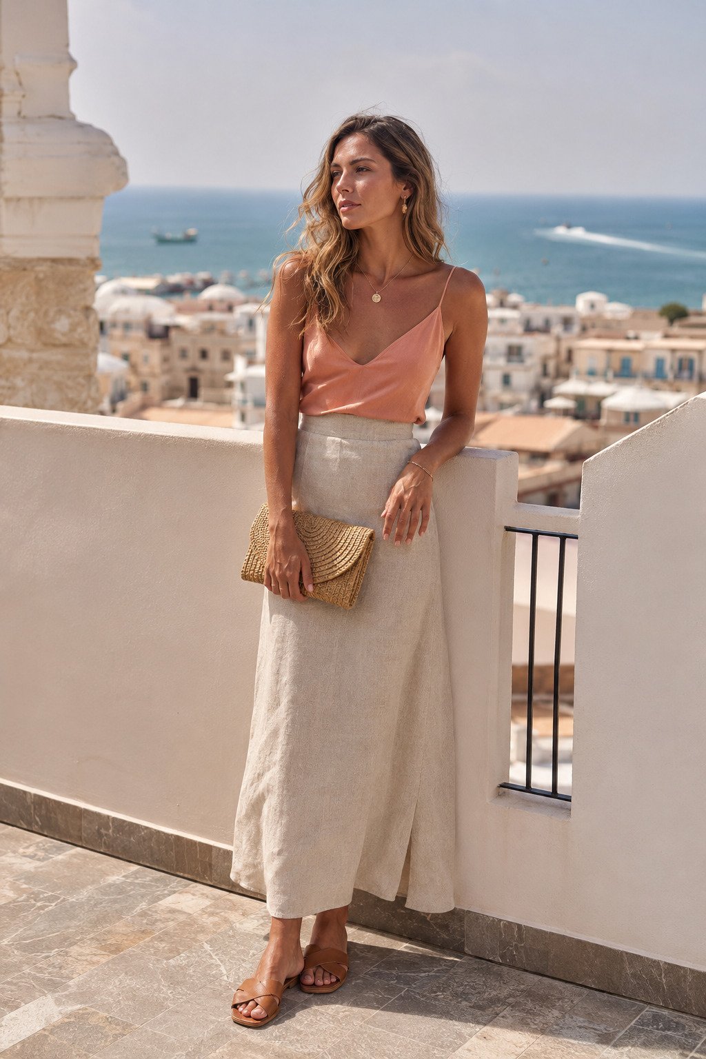
Dusty coral and oat give beach outfits warmth without feeling sugary
Coral can go too bright very quickly, which is why a muted dusty version feels more polished for this kind of article. Set against oat or natural linen, it adds warmth and personality while still keeping the look elegant and easy.
This color story works especially well when the fabrics feel breezy and matte. A soft camisole, linen skirt, or washed cotton piece keeps the coral refined and stops it from turning into a louder, tropical-postcard look.
Why quiet-luxury color combos work so well at the beach
Strong beach style does not always need statement pieces. More often, it comes from restraint: choosing one soft neutral, one grounding tone, and letting texture, light, and silhouette do the rest.
That is why these pairings feel more expensive than louder combinations. They stay calm in full sun, they layer well across a suitcase, and they make everyday resort pieces look more intentional in photos.
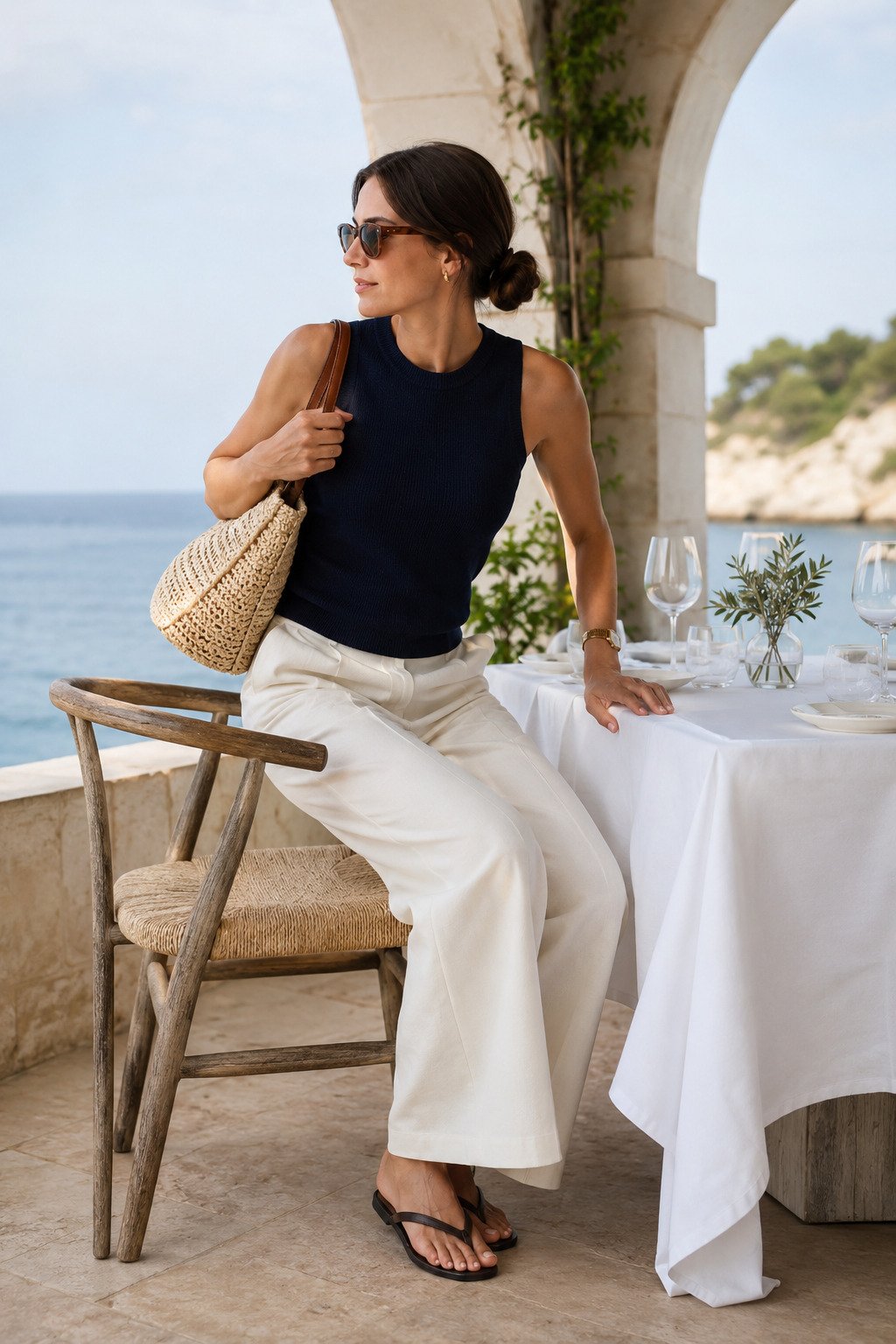
Navy and ecru stay classic, but the right textures make them feel fresh
There is a reason this pairing never disappears from resortwear. Navy gives shape, ecru keeps things soft, and together they feel polished enough for lunches, sea-view hotels, and any setting where you want reliable elegance.
To keep it from feeling too familiar, lean into breathable knits, looser trousers, or gentle drape. That bit of softness keeps the combo in vacation territory instead of making it look like a recycled office palette near the coast.
Sage and cocoa brown feel a little moodier in the best way
If your usual beach outfits lean too pale or washed out, this is a smart way to bring in more depth while staying tasteful. Sage keeps the palette cool and relaxed, while cocoa adds richness that still feels softer than black.
This combination is especially strong in garden paths, shaded terraces, and lower evening light. It brings a more editorial vacation mood without asking for anything complicated in the silhouette itself.
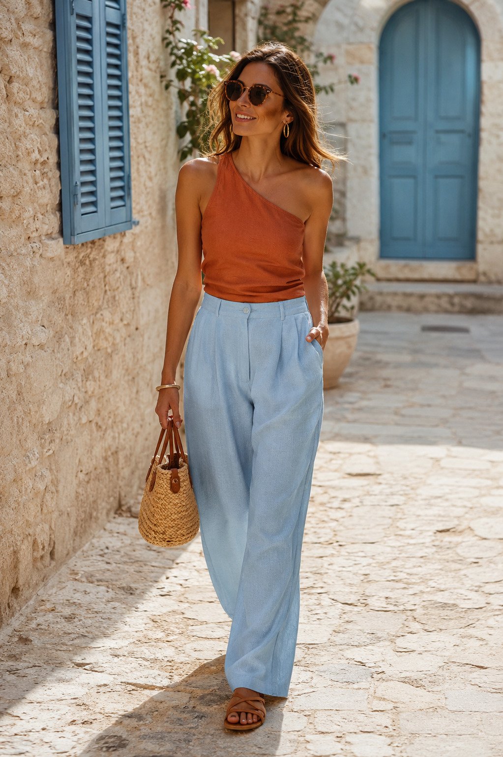
Terracotta and pale blue bring warmth and airiness into the same look
This pairing feels like a smarter alternative to louder Mediterranean color stories. Terracotta adds heat and richness, while pale blue opens the look back up and keeps it wearable during the day.
It is a great option for stone streets, market stops, or resort towns where you want a little more visual pull in photos. The contrast is clear, but because both shades feel weathered and natural, the result still lands as refined.
Soft charcoal and vanilla are perfect when beach plans run into town plans
Some vacation outfits need to bridge a few different moments without a full change. Soft charcoal gives enough shape for later hours, and vanilla keeps the look relaxed enough for the coast.
Think of this as your easiest beach-to-town color story when you do not want to overpack. It works for late coffee, boutiques, pre-dinner walks, and those in-between hours when an all-white outfit suddenly feels too bright.
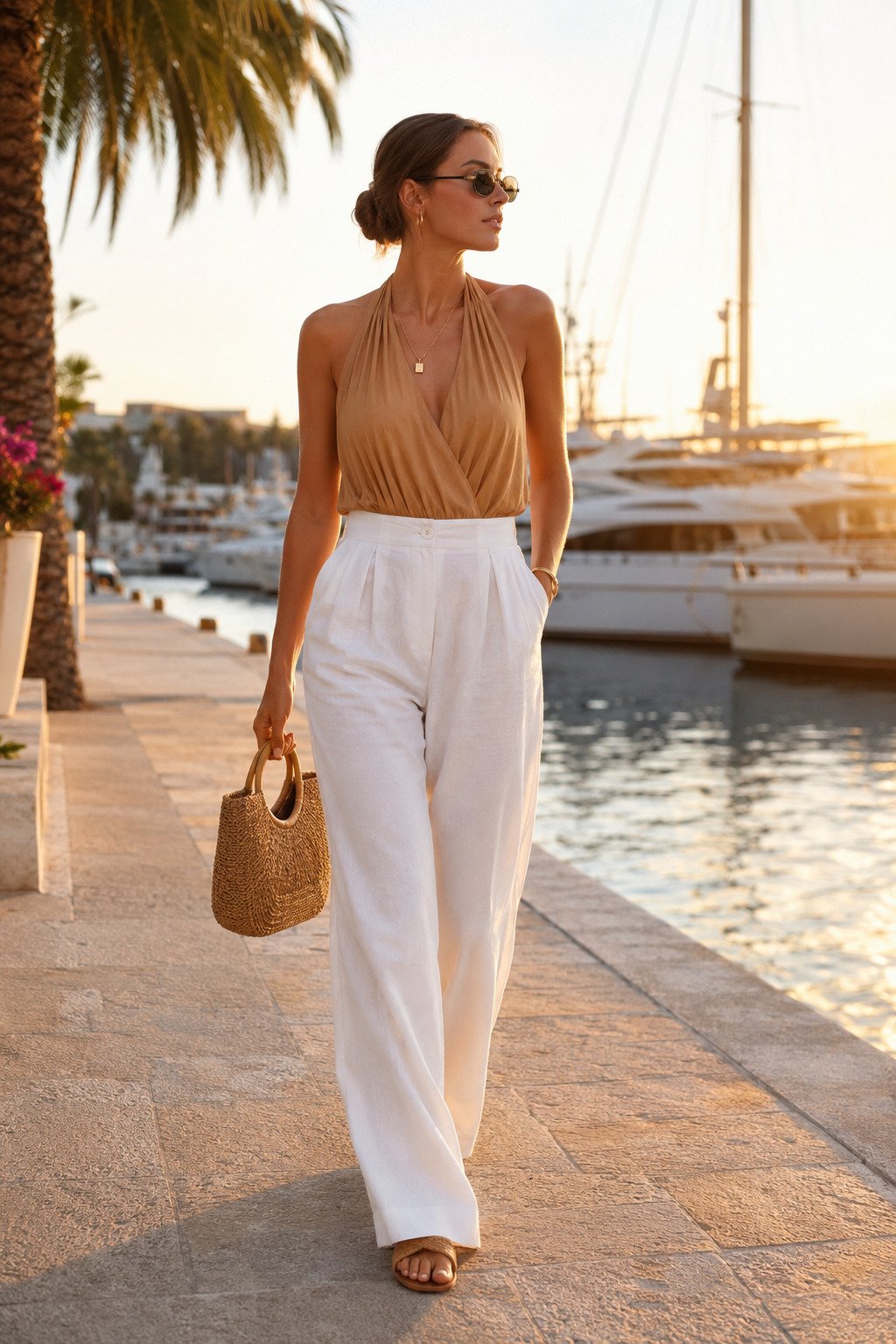
Honey tan and crisp white make golden-hour dressing feel easy
This pairing works because it catches warm light beautifully. White keeps the outfit sharp, while honey tan adds glow and softness that look especially good around sunset, sea reflections, and marina settings.
It is also one of the easiest combinations to elevate with almost nothing. A better earring, a slimmer sandal, or a more structured bag is enough to shift the whole outfit toward dinner without changing the formula itself.
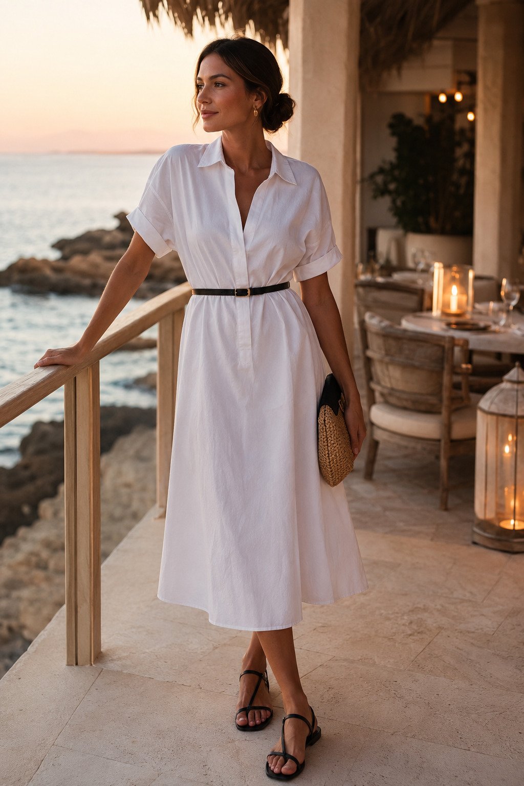
Soft white with black accents is the cleanest way to finish the day
When the light starts to change and the day edges toward dinner, a mostly white outfit with one neat black accent looks calm, sharp, and very expensive. The contrast is there, but it stays controlled and understated.
This is one of the most reliable formulas for readers who want something elegant without feeling dressed up. It keeps the beach-day ease, but the darker belt or sandal gives the outfit enough structure to carry into evening plans.
How to use these color combos on a real trip
The smartest way to apply this guide is to pack two or three core neutrals, then add one or two softer color accents that can repeat across multiple outfits. White, cream, oat, sand, navy, and soft charcoal can carry most of the suitcase. Then you can rotate in butter yellow, dusty coral, pale blue, sage, or terracotta depending on the mood you want.
If you are building a full vacation wardrobe around this story, pair it with beach-to-dinner outfit switches, beach club outfit ideas, and Mediterranean-inspired beach outfits for more visual direction.
Quiet-Luxury Beach Color Questions
What colors make beach outfits look more expensive?
Soft white, cream, oat, stone, navy, chocolate brown, olive, and muted warm tones usually read the most refined because they look calmer and more intentional in bright daylight.
Do quiet-luxury outfits always need neutrals?
No. They just need controlled color. Muted butter yellow, dusty coral, pale blue, terracotta, and sage can all work beautifully when they are paired with softer grounding shades.
How many color stories should you pack for a beach vacation?
Usually three is enough: one clean light neutral story, one darker grounding story, and one warmer accent story. That keeps the suitcase focused and makes repeat outfits easier.
Is black too harsh for beach days?
Not when it is softened with cream, white, or textured fabric. A little black can add shape and polish, especially for pool lounges, later lunches, or sunset plans.